How to photograph our home galaxy from here on Earth
Life Through Lynsey's Lens
A blog about travel, photography, and all the life in between
Life Through Lynsey's Lens
A blog about travel, photography, and all the life in between
A blog about travel, photography, and all the life in between
A blog about travel, photography, and all the life in between
Milky Way 201: Post-Processing
How to make your Milky Way photos look pretty
Now that you know how to get out there and take Milky Way photos (assuming you read my earlier post, Milky Way 101), it’s time to learn how to make them look good! May is the best month for Milky Way, so try to get out there and give it a shot.
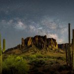
You might remember that last time I ended on a cliff-hanger, reminding you that your photos won’t look great straight out of the camera and showing a before and after shot to emphasize the point. Luckily, Milky Way post-processing is pretty simple.
This is one of those topics where, as my high school math teacher used to say, “there’s more than one way to skin a cat” (honestly that’s a horrible saying). A quick Google search for “how to post-process milky way photos” will yield plenty of different tutorials, all using different techniques and softwares. (Oh hey, I guess that means I didn’t even need to write this, huh?) This tutorial is a beginner’s guide using only Adobe Lightroom, teaching you how to tweak all of the different sliders to get your photos looking nice with minimal steps, minimal software, and minimal headache. And if you’re not a Lightroom user? I suggest you continue reading anyway–most of the tools I’m going to talk about are very basic and should be included in any photo editing software. The screenshots just won’t be as helpful.
So let’s get started!
Here is the straight-out-of-camera (SOOC) RAW image as displayed in Lightroom. You’ll notice it’s pretty dark and flat. You’ll find the camera settings up in the top-left corner. This one was shot a couple years ago with my Canon 5D Mark IV.

First, I always scroll down to the Lens Calibration menu and check both “Remove Chromatic Aberration” and “Lens Profile Correction”. Lightroom should fill in the lens information automatically, but in case it doesn’t you should be able to find your lens in the list. This helps remove some distortion and vignetting caused by the wide lenses we typically use for Milky Way, and removing chromatic aberration just makes the image look a bit better (you’ll notice the difference the most on cheap lenses). Chromatic aberration (CA) can be seen as odd colors around the edges of a subject, typically cyan or magenta, and is caused by the lens not focusing all color wavelengths properly. High-quality lenses usually do a really good job of tuning their optics so you won’t see as much, if any, CA, but Lightroom’s automatic removal tool is really smart so, as far as I can tell, there’s no downside to checking the box. I do so on every single photo I edit.

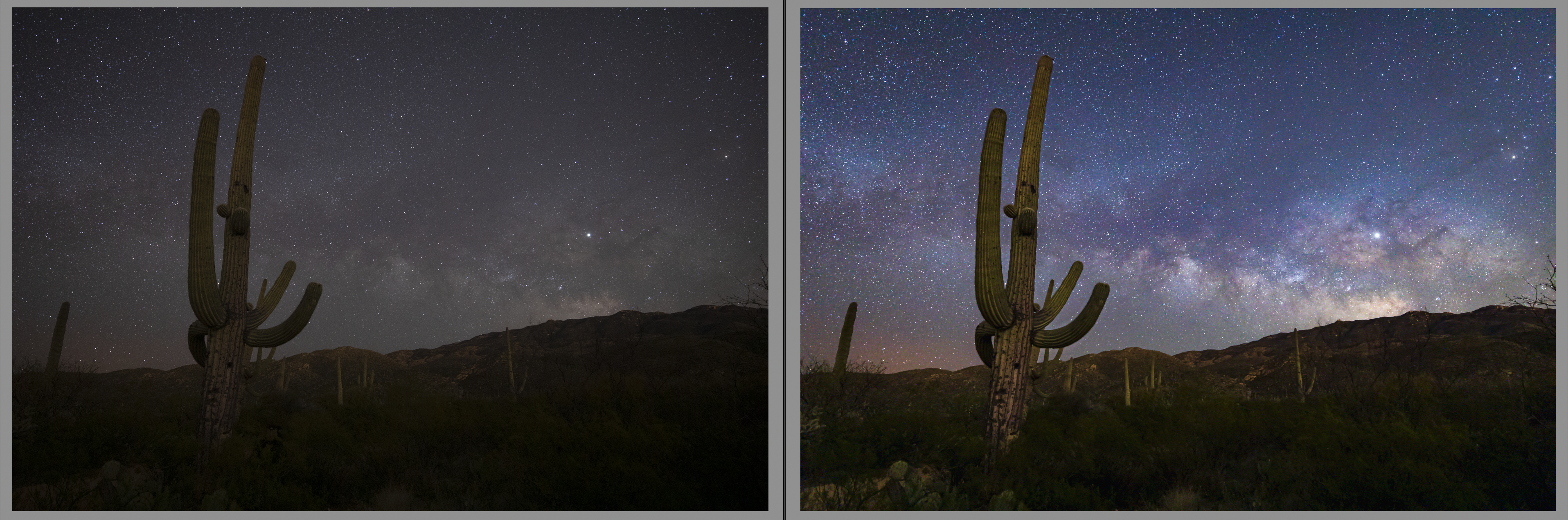
Now scroll back up to the top of the develop panel. The first set of sliders is white balance, which we want to adjust to the appropriate level in order to make the colors of the core really “pop”. This is going to vary for every image, so it’s always the first thing I do after the lens adjustments. One trick to do this is to first bump the vibrance and saturation both up to 100 (temporarily!).

Then tweak the white balance sliders until you get a mostly blue sky with warmer tones in the Milky Way core. This should be the point that allows the most core detail to stick out from the blue sky, and is usually easier to find if the Milky Way is higher above the horizon, away from atmosphere and light pollution. Once you’re satisfied with your white balance level, go ahead and bump the vibrance and saturation back down to zero. At this point the whole image should look a bit flatter and the sky should be kind of a cool grey color–that’s on purpose, and it’s going to get better.

The next thing I like to do with all of my images is take a look at the different color profiles. I’m partial to Adobe Landscape and Adobe Vivid. These are just personal taste, so click around and see which ones you like.

Next, start tweaking the settings. While you can start a lot of photos from Lightroom’s “Auto” button, I don’t recommend doing that with nightscapes. The software isn’t smart enough (yet) to know that it’s supposed to be pretty dark, so I always edit these manually.
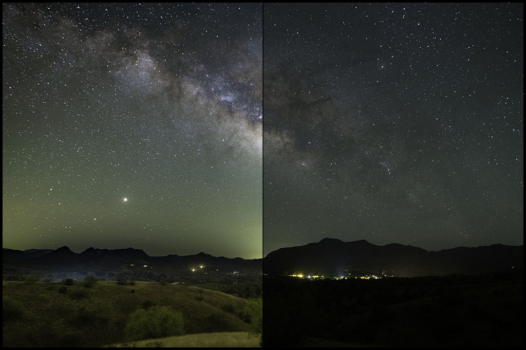
I begin by bumping the exposure up enough that you can see the foreground clearly (usually end up dialing it back a bit later). Pull the highlights down a bit to get rid of any light pollution on the horizon. You can be pretty heavy-handed with this—this shot didn’t need much, but a lot of times I bring it all the way down to -100. Bump the shadows to bring out more detail in the foreground. Don’t worry if it’s looking too bright, it will come back down later. (Bright is good—it means you set your exposure settings well in the field!) Finally, don’t forget to adjust the white and black points.

I like to pull down the clarity a bit and bump up the texture slider. It makes the foreground and the details of the core “pop”, while not making the stars stick out too much. In my opinion, an image with too many big, bright stars really takes away from the core itself. Next, I personally like a lot of vibrance and saturation in my Milky Way images. This is another matter of personal taste, and you’ll meet people who feel strongly about it both ways. Finally, adding just a little bit of dehaze makes the sky nice and bold.

I don’t typically do much with the Tone Curve. I do try out the Medium and Strong Contrast presets and see how they look—often Medium is enough, as seen here.

Next is sharpening and noise reduction. I have these settings saved as a preset, they fit most of my night sky shots with a bit of tweaking. Luminance varies quite a bit—normally mine is about 40 to 60. It will really depend on your ISO and your camera, as well as how much detail you care to sacrifice to reduce noise.

Finally, I like to add a little bit (-10 to -20) of vignette. I find that the corners of images taken with a wide angle lens tend to look kind of icky, especially if your settings are brighter, so the vignette can help with that. I also like to warm up the shadows a bit from the Calibration panel—I think it makes for a nicer sky tone.

Now for some of the more advanced techniques….
The first tool we’re going to use is the spot removal tool. You might have noticed that I caught someone standing under that big saguaro. I’m pretty picky about stuff like that, especially because it’s so easy to fix. Simply grab the spot removal tool and get rid of him by cloning some of the foreground brush. This is also a great tool to clean up hot pixels, signs, airplanes, and anything else that makes your shot look less than stellar (pun intended).


Next, one of the most important things that I always do for my Milky Way shots is a gradient filer over the foreground.

You can use the brush mode to include areas outside of the filter, like this big saguaro. (If you don’t see your filter highlighted in red, there is a checkbox at the bottom to enable/disable the mask overlay. I find it easier to see what I’m doing with it on, then I turn it off as I tweak my settings.)

I like to boost the exposure and shadows a bit to pull out some of the detail, as well as put back some of that clarity we reduced earlier. Some photographers gradient the sky instead, but I prefer to edit for the sky and then tweak the foreground, since the sky is the whole point of the photo.

Last, but certainly not least, I use a very subtle brush to warm up and emphasize the core. This is another set of settings that I have saved to a preset, as it tends to be a “one-size-fits-all”.

Voilla! I think that turned out pretty nice.

Of course you can get much more complicated with the post-processing, but this basic workflow will get you pretty far. Another thing you can do of course is crop the image more, but I didn’t feel like this one needed it. Some lenses get quite a bit of coma in the corners so you might want to crop them in just to hide the icky stretched out stars.
I hope you found this tutorial helpful! If I glossed over any details or if you have any other questions, feel free to drop a comment below.